React Native 之 flexbox布局
本文详情
本文讲解React Native中的布局,该布局用CSS的flex布局,掌握了这个布局对后面RN应用的开发用途非常之大。
常用属性
RN的flexbox主要有以下几个属性:
- felxDirection
- alignItems
- justifyContent
- alignSelf
- flex
- flexWrap
flexDirection
该属性用于指定主轴的方向。即指定字view的布局方向。他有两个值可设置
- row: 横向布局
- column: 纵向布局
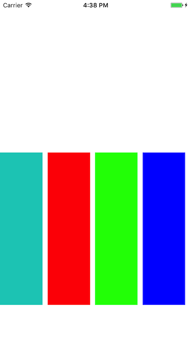
这个属性很简单,先看row的代码段
|
|
|
|
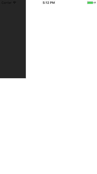
一个View里面有四个小View,效果图如下:
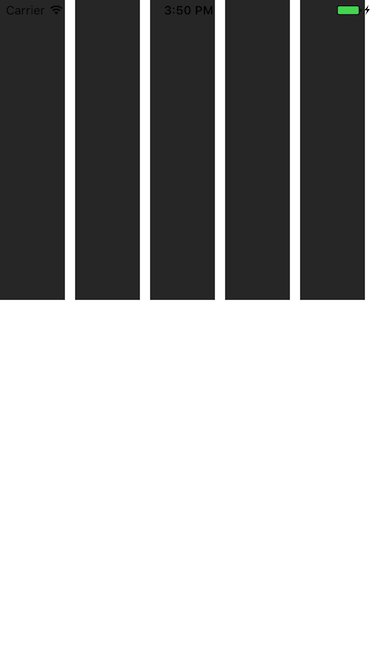
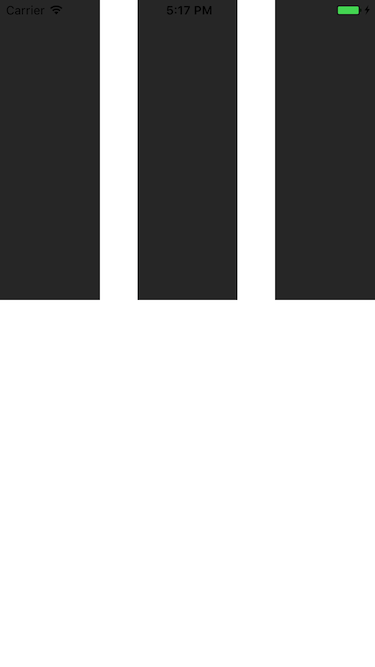
可以看到,四个View横向的进行布局。那改成column呢,样式修改如下:
|
|
效果如下:
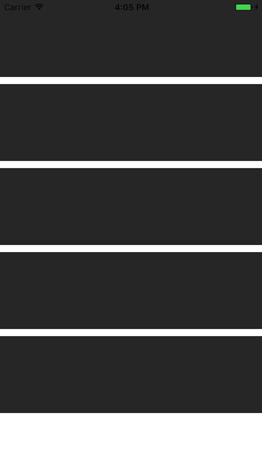
纵向布局
### alignItems
用于定义子组件在垂直方向上的对齐方式。有四个属性可以设置:flex-start,flex-end,center,stretch。
- flex-start: 与父容器的顶部对齐。
- flex-end: 与父容器的底部对齐。
- center: 处于父容器的中间位置(竖直居中)。
- stretch: 竖直上填充整个容器。
##### flex-start,改变一下子组件的颜色,代码如下:
|
|
|
|
看下效果图:
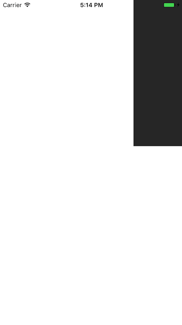
这就是和父容器顶部对齐。
看下flex-end属性,只要修改alignItems属性就好了,效果如下:
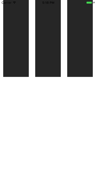
可以看到,子视图 和 父容器的底部对齐了。
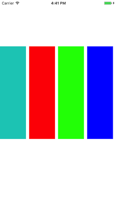
再看下center,用得最多的属性,它会让子组件位于父容器的中间位置:
stretch 就是竖直填充,前提是子组件没有设置height属性。
修改样式代码如下:
|
|
看下效果图:
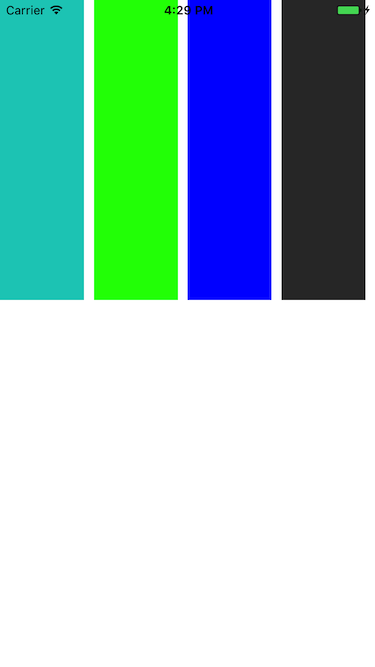
justifyContent
有竖直就有水平,justifyContent和alignItems是相对的。它有五个属性可以设置,分别是flex-start,flex-end,center,space-between,space-around。
- flex-start: 与父容器左端对齐
- flex-end: 与父容器右端对齐
- center:水平居中
- space-between: 第一个子组件位于父容器左端,最后一个子组件位于父容器最右端。然后平均分配在父容器水平方向上。
- space-around: 所有子组件平均分配在父容器的水平方向上,左右都有留空隙。
水平居中(center)代码如下:
|
|
|
|
父容器设置了justifyContent:’center’属性,所以理论上子组件应该会水平剧中,来看下是否正确。如下:
justifyContent: ‘flex-start’,水平居左:
justifyContent: ‘flex-end’, 水平居右
这些都挺简单的,来看下space-between和space-around的区别,先看下space-between的效果图:
可以看到它左右都不留空隙。均匀分布。 再看下space-around的效果图:
它左右都留有空隙,是平均的位于整个界面的水平方向上。
alignSelf
该属性用来设置单独组件的竖直对齐方式,与alignItem有点像。有五个属性可以设置,auto,flex-start,flex-end,center,streth
- auto:按照自身设置的宽高来显示,如果没设置,效果跟streth一样。
- flex-start: 与父容器顶部对齐
- flex-end: 与父容器底部对齐
- center: 位于垂直位置
- streth: 垂直拉伸
这个用法跟上面的很像,只是它用于单个组件,如本例子的子View中,看下代码:
|
|
|
|
以上几个子View设置了不同的样式 ,看下效果图:
看到了,flex-start就是顶部对齐,flex-end就是与底部对齐。第三个View是streth,垂直拉伸了。第四个View是auto,因为设置了高度,所以显示如图所示。没有显示center,但它的效果可想而知,就不再演示啦。
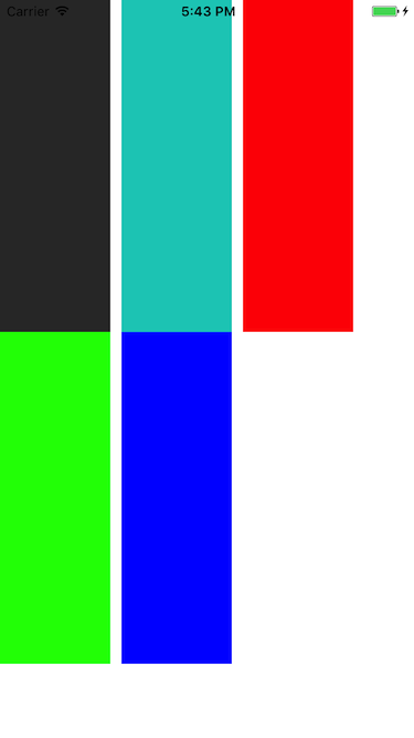
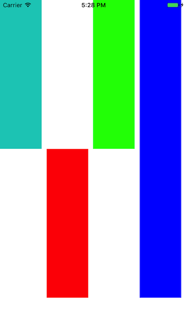
5.flex
flex指设置伸缩项目的伸缩样式,可以把它类比成android中的weight属性。 看一个代码就清楚它的用法了。
|
|
|
|
效果图如下:
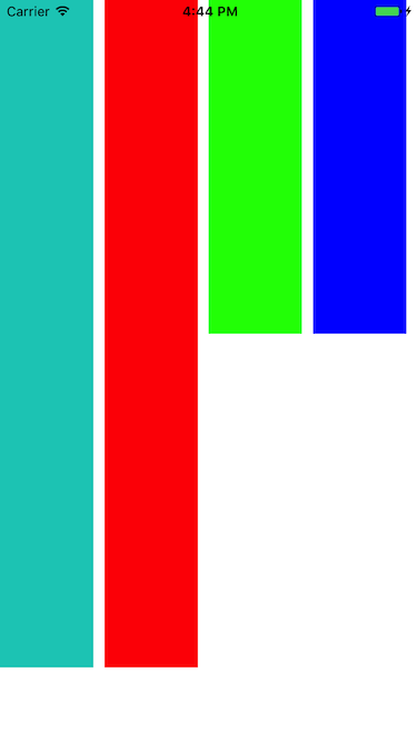
可以看到,flex为2的组件宽度为flex为1宽度的两倍,flex为4组件宽度则为flex为1的组件宽度的4倍
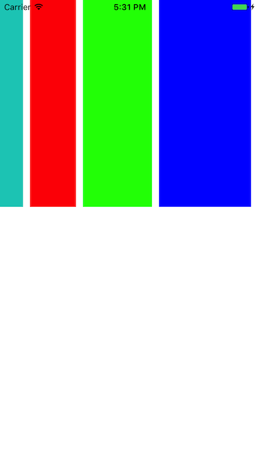
6.flexWrap
其实这些属性都是CSS原有的属性,只是RN只支持了部分的属性。flexWrap用于设置是否可换行,有两个属性可设置nowrap和wrap。
- nowrap: 即使空间不够也不换行
- wrap: 空间不够的话自动换行
样式代码:
如设置成wrap时,空间不够效果图如下: